
##发现官方toggle 有些功能不全或不符合项目使用
###1. isChecked true的情况 background没有隐藏导致换图片颜色比较浅
###2.不支持Lable 更换颜色
###我就 coyp了下官方Toggle并继承 cc.Toggle 做了些扩展( 但是编辑器有个警告不知道怎么处理 还有 继承后属性框上面的 按钮点击选项都展开了也不清楚怎么处理 还望官方有空可以指导下 )
)
###支持 没有做支持多个Label情况
###1.isChecked true false更改Label 颜色进行更改
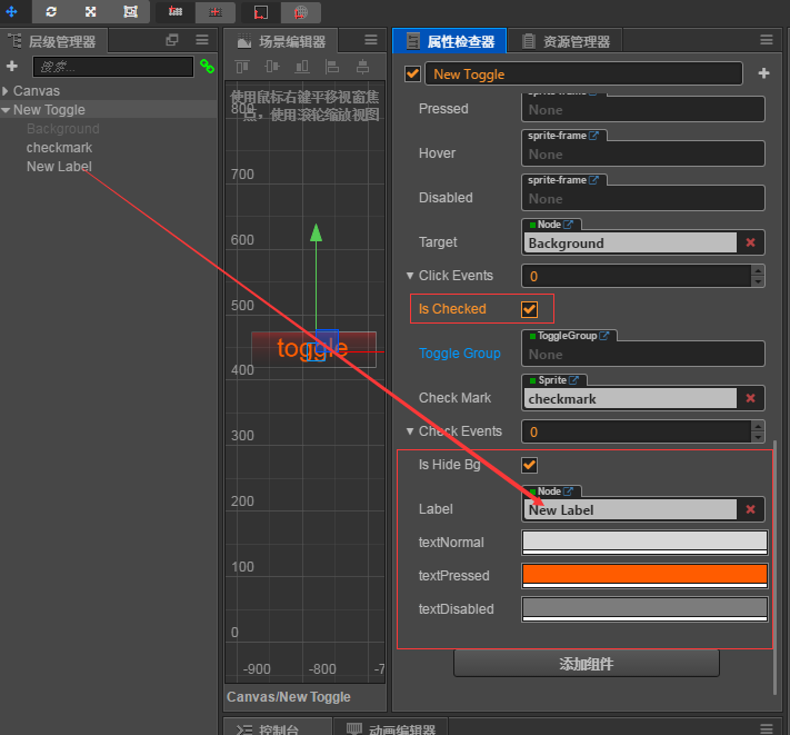
###2.isHideBg 如果 true isChecked 进行切换 background&checkmark 只能同时一个显示 isHideBg false 和官方isChecked 切换相同
###上两张效果图
###

###
下面是全部代码
// ToggleV.js 文件如下
/****************************************************************************
 Copyright (c) 2013-2016 Chukong Technologies Inc.

 http://www.cocos.com

 Permission is hereby granted, free of charge, to any person obtaining a copy
 of this software and associated engine source code (the "Software"), a limited,
  worldwide, royalty-free, non-assignable, revocable and  non-exclusive license
 to use Cocos Creator solely to develop games on your target platforms. You shall
  not use Cocos Creator software for developing other software or tools that's
  used for developing games. You are not granted to publish, distribute,
  sublicense, and/or sell copies of Cocos Creator.

 The software or tools in this License Agreement are licensed, not sold.
 Chukong Aipu reserves all rights not expressly granted to you.

 THE SOFTWARE IS PROVIDED "AS IS", WITHOUT WARRANTY OF ANY KIND, EXPRESS OR
 IMPLIED, INCLUDING BUT NOT LIMITED TO THE WARRANTIES OF MERCHANTABILITY,
 FITNESS FOR A PARTICULAR PURPOSE AND NONINFRINGEMENT. IN NO EVENT SHALL THE
 AUTHORS OR COPYRIGHT HOLDERS BE LIABLE FOR ANY CLAIM, DAMAGES OR OTHER
 LIABILITY, WHETHER IN AN ACTION OF CONTRACT, TORT OR OTHERWISE, ARISING FROM,
 OUT OF OR IN CONNECTION WITH THE SOFTWARE OR THE USE OR OTHER DEALINGS IN
 THE SOFTWARE.
 ****************************************************************************/

/**
 * !#en The toggle component is a CheckBox, when it used together with a ToggleGroup, it
 * could be treated as a RadioButton.
 * !#zh Toggle 是一个 CheckBox,当它和 ToggleGroup 一起使用的时候,可以变成 RadioButton。
 * @class Toggle
 * @extends Button
 */


var Toggle = cc.Class({
    name: 'ToggleV',
    extends: cc.Toggle,
    editor: CC_EDITOR && {
        menu: 'i18n:MAIN_MENU.component.ui/ToggleV',
        help: 'i18n:COMPONENT.help_url.toggle',

        ///// 打开下面的属性会显示系统默认的 toggle.js 没找到这个引用文件在哪里 很想copy一份添加自定义的字段 if: isHideBg ///////
        // inspector: 'packages://inspector/inspectors/comps/toggle.js', //
    },

    properties: {
        // vAdd 这里设置是否显示
        isHideBg:{ // vAdd 照抄 下面注释的最后一个 官方的代码
            default:false, // 默认是官方状态
            tooltip: CC_DEV &&'如果设置为true该Toggle的target即background在isChecked隐藏或者显示',
            notify: function() {
                this._updateCheckMark();
            }
        },
        // vAdd 这里设置是否显示
        Label:{
            default:null,
            tooltip: CC_DEV &&'isChecked Label or richText',
            type:cc.Node,
            notify: function() {
                this._updateCheckMark();
            }
        },
        // vAdd 这里设置是否显示
        /**
         * !#en Normal state color.
         * !#zh 普通状态下按钮所显示的颜色。
         * @property {Color} normalColor
         */
        normalColorText: {
            default: cc.color(214, 214, 214),
            displayName: 'textNormal',
            tooltip: CC_DEV && 'i18n:COMPONENT.button.normal_color',
            notify: function () {
                this._updateCheckMark();
            }
        },

        // vAdd 这里设置是否显示
        /**
         * !#en Pressed state color
         * !#zh 按下状态时按钮所显示的颜色。
         * @property {Color} pressedColor
         */
        pressedColorText: {
            default: cc.color(255, 211, 211),
            displayName: 'textPressed',
            tooltip: CC_DEV && 'i18n:COMPONENT.button.pressed_color',
        },

        // vAdd 这里设置是否显示
        /**
         * !#en Disabled state color
         * !#zh 禁用状态下按钮所显示的颜色。
         * @property {Color} disabledColor
         */
        disabledColorText: {
            default: cc.color(124, 124, 124),
            displayName: 'textDisabled',
            tooltip: CC_DEV && 'i18n:COMPONENT.button.disabled_color',
            notify: function () {
                this._updateCheckMark();
            }
        },

        // /**
        //  * !#en When this value is true, the check mark component will be enabled, otherwise
        //  * the check mark component will be disabled.
        //  * !#zh 如果这个设置为 true,则 check mark 组件会处于 enabled 状态,否则处于 disabled 状态。
        //  * @property {Boolean} isChecked
        //  */
        // isChecked: {
        //     default: true,
        //     tooltip: CC_DEV && 'i18n:COMPONENT.toggle.isChecked',
        //     notify: function() {
        //         this._updateCheckMark();
        //     }
        // },
    },

    onEnable: function () {
        this._super();

        if(!CC_EDITOR) {
            this._registerToggleEvent();
        }
        if(this.toggleGroup && this.toggleGroup.enabled) {
            this.toggleGroup.addToggle(this);
        }
        this.Label&& (this.Label.color = !this.isChecked?this.normalColorText:this.pressedColorText); // // vAdd 这里设置是否显示
    },

    onDisable: function () {
        this._super();
        if(!CC_EDITOR) {
            this._unregisterToggleEvent();
        }
        if(this.toggleGroup && this.toggleGroup.enabled) {
            this.toggleGroup.removeToggle(this);
        }
        this.Label&& (this.Label.color = this.disabledColorText); // vAdd 这里设置是否显示
    },

    _updateCheckMark: function () {
        if(this.checkMark) {
            this.checkMark.node.active = !!this.isChecked;
            this.isHideBg && (this.target.active = !this.isChecked); // vAdd 这里设置是否显示
            !this.isHideBg && (this.target.active = true); // vAdd 这里设置是否显示
            this.Label&& (this.Label.color = !this.isChecked?this.normalColorText:this.pressedColorText); // vAdd 这里设置是否显示
        }
    },

    _updateDisabledState: function () {
        this._super();

        if(this.checkMark) {
            this.checkMark._sgNode.setState(0);
        }
        if(this.enableAutoGrayEffect) {
            if(this.checkMark && !this.interactable) {
                this.checkMark._sgNode.setState(1);
            }
        }
        this.Label&& this.interactable? (this.Label.color = !this.isChecked?this.normalColorText:this.pressedColorText): (this.Label.color = this.disabledColorText); // vAdd 这里设置是否显示
    },

    _registerToggleEvent: function () {
        this.node.on('click', this.toggle, this);
    },

    _unregisterToggleEvent: function () {
        this.node.off('click', this.toggle, this);
    },

    toggle: function (event) {
        if(this.toggleGroup && this.toggleGroup.enabled && this.isChecked) {
            if(!this.toggleGroup.allowSwitchOff) {
                return;
            }
        }
        this.isChecked = !this.isChecked;

        this._updateCheckMark();


        if(this.toggleGroup && this.toggleGroup.enabled) {
            this.toggleGroup.updateToggles(this);
        }

        this._emitToggleEvents(event);
    },

    _emitToggleEvents: function () {
        this.node.emit('toggle', this);
        if(this.checkEvents) {
            cc.Component.EventHandler.emitEvents(this.checkEvents, this);
        }
    },

    /**
     * !#en Make the toggle button checked.
     * !#zh 使 toggle 按钮处于选中状态
     * @method check
     */
    check: function () {
        if(this.toggleGroup && this.toggleGroup.enabled && this.isChecked) {
            if(!this.toggleGroup.allowSwitchOff) {
                return;
            }
        }

        this.isChecked = true;

        if(this.toggleGroup && this.toggleGroup.enabled) {
            this.toggleGroup.updateToggles(this);
        }

        this._emitToggleEvents();
    },

    /**
     * !#en Make the toggle button unchecked.
     * !#zh 使 toggle 按钮处于未选中状态
     * @method uncheck
     */
    uncheck: function () {
        if(this.toggleGroup && this.toggleGroup.enabled && this.isChecked) {
            if(!this.toggleGroup.allowSwitchOff) {
                return;
            }
        }

        this.isChecked = false;

        this._emitToggleEvents();
    }


});

cc.ToggleV = module.exports = Toggle;

/**
 * !#en
 * Note: This event is emitted from the node to which the component belongs.
 * !#zh
 * 注意:此事件是从该组件所属的 Node 上面派发出来的,需要用 node.on 来监听。
 * @event toggle
 * @param {Event.EventCustom} event
 * @param {Toggle} event.detail - The Toggle component.
 */