Creator 3.8.4 Mac
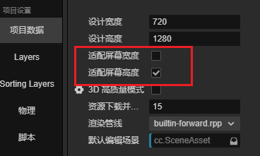
适配发现 iPad 类型屏幕下(高度适配)
/**
 * 进行一次屏幕适配计算
 * 屏幕适配的逻辑是: 根据实际的屏幕框高,设置适配
 * 1、实际屏幕更宽(iPad) -> 那么进行高度适配
 * 2、实际屏幕更高(iPhoneX) -> 进行宽度适配
 * 两种适配都保证了手机能把设计分辨率的内容全显示到手机上
 * 这时候,计算在设计分辨率意义下的屏幕尺寸,将变量存储到 viewSize 中
*/
function AdaptViewSize(): boolean {
    let resolutionPolicy: ResolutionPolicy = view.getResolutionPolicy();
    let designSize = view.getDesignResolutionSize();
    let frameSize = screen.windowSize;
    let frameW = frameSize.width;
    let frameH = frameSize.height;
    /** 是否是屏幕更宽 */
    const isScreenWidthLarger = (frameW / frameH) > (designSize.width / designSize.height);
    let targetResolutionPolicy = isScreenWidthLarger ? ResolutionPolicy.FIXED_HEIGHT : ResolutionPolicy.FIXED_WIDTH;
    if (targetResolutionPolicy !== resolutionPolicy.getContentStrategy().strategy) {
        /** 保证设计分辨率的内容都能显示出来 */
        view.setDesignResolutionSize(designSize.width, designSize.height, targetResolutionPolicy);
    }

    /** 实际的尺寸会和设计分辨率在一个维度,但是宽或高更大 */
    if (isScreenWidthLarger) {
        G_VIEW_SIZE.width = Math.ceil(designSize.height * frameSize.width / frameSize.height);
        G_VIEW_SIZE.height = designSize.height;
    } else {
        G_VIEW_SIZE.width = designSize.width;
        G_VIEW_SIZE.height = Math.ceil(designSize.width * frameSize.height / frameSize.width);
    }

    console.log(`屏幕${isScreenWidthLarger ? "更宽, 高度适配" : "更高, 宽度适配"} 设计分辨率比例下的屏幕尺寸: ${G_VIEW_SIZE.width}x${G_VIEW_SIZE.height}`);

    RefreshSafeRect()

    return isScreenWidthLarger;
}
UI 模块初始化时,进行适配
    init(canvas: Canvas) {
        if (this.m_Node) {
            console.error("[UIModule] 只能调用一次 init");
            return;
        }
        this.m_Node = canvas.node;

        // 非常操蛋,解决 iPad 没刷新的问题
        const WIN_SIZE_W = screen.windowSize.width;
        const WIN_SIZE_H = screen.windowSize.height;
        let isScreenWidthLarger = AdaptViewSize()
        if (isScreenWidthLarger) {
            screen.windowSize = new Size(WIN_SIZE_W + 1, WIN_SIZE_H);
            screen.windowSize = new Size(WIN_SIZE_W, WIN_SIZE_H);
        }


        F_SET_SIZE(this.node, this.viewSize.width, this.viewSize.height)

        for (let i = EViewLayer.Scene; i <= EViewLayer.Toast; ++i) {
            let layer = new GuiLayer(i, F_CREATE_UI_NODE(EViewLayer[i], this.node));
            this.m_Layers.push(layer);
        }
        /**
         * 监听屏幕尺寸改变
         */
        screen.on("window-resize", () => {
            AdaptViewSize();
            F_SET_SIZE(this.node, G_VIEW_SIZE.width, G_VIEW_SIZE.height);
            this.m_Layers.forEach(layer => layer.resize(G_VIEW_SIZE));
            inst.get(EventBox).emit(FWEvent.VIEW_RESIZE, G_VIEW_SIZE);
        });
    }
问题在于 setDesignResolutionSize 没有生效。进行了一次蛋疼的处理。很不优雅。之前好像没这个情况?
        const WIN_SIZE_W = screen.windowSize.width;
        const WIN_SIZE_H = screen.windowSize.height;
        let isScreenWidthLarger = AdaptViewSize()
        if (isScreenWidthLarger) {
            screen.windowSize = new Size(WIN_SIZE_W + 1, WIN_SIZE_H);
            screen.windowSize = new Size(WIN_SIZE_W, WIN_SIZE_H);
        }