
写在前边

宗宝的独立游戏【穿越奇迹】现已上线:
- Cocos插件,
- 微信小游戏,
- 抖音小游戏,
- 头条小游戏,
- TapTap平台。
大家可以搜索游戏名称:穿越奇迹 进行游戏体验。欢迎大家为游戏提出宝贵的意见
商城源码 商城源码已更新,并开启限时折扣
正文
在使用Cocos Creator 开发的过程中,组件的重要性显而易见。编辑器内部已经为我们提供了开发中大多数组件,让我们可以在编辑器中通过简单的配置就可以改变对应功能,来实现不同的效果。
1.默认组件布局
摄像机组件

文本渲染组件
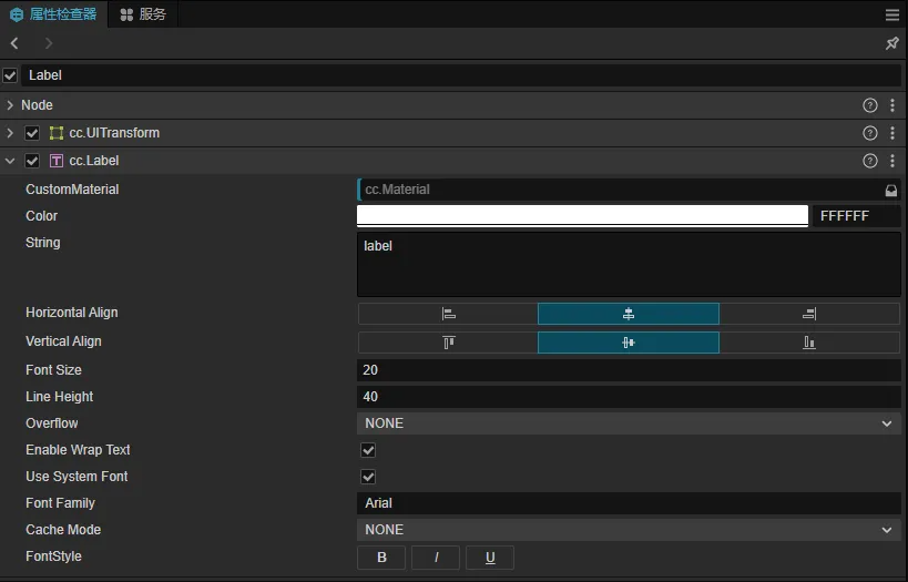
上边列举出来的,是Cocos Creator内部组件以及默认的布局样式,当然除了这些还有很多很多。
2.自定义组件渲染
上图中显示的布局,对应每一种类型,引擎都已经帮我们写好了一套默认的布局样式,我们只需要在组件类规定好对应装饰器的类型即可。
如何在组件布局中显示一个按钮?
通过查找文档,我们会在插件开发自定义属性检查器面板中的自定义 Component 渲染找到答案。
1.我们新建一个插件,注册 contributions.inspector 信息
"contributions": {
    "inspector": {
        "section": {
            "node": {
                "CustomComponent": "./dist/custom-component.js"
            }
        }
    }
},
2.编写一个 src/custom-component.ts
'use strict';
const { updatePropByDump, disconnectGroup } = require('./prop');
type Selector<$> = { $: Record<keyof $, any | null> }
export const template = ``;
export const $ = {
};
export function update(this: any, dump: any) {
}
export function ready(this: any) {
}
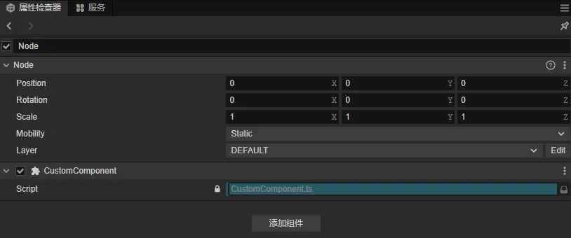
3.项目内创建CustomComponent.ts 脚本
import { _decorator, Component, Node } from 'cc';
const { ccclass, property } = _decorator;
@ccclass('CustomComponent')
export class CustomComponent extends Component {
    start() {
    }
    update(deltaTime: number) {
    }
}
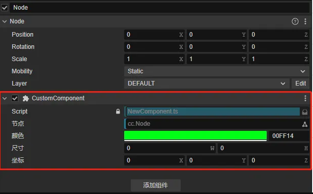
此时编译插件后,将脚本挂在节点下的效果:
4.添加Button按钮
定义按钮以及按钮样式
export const template = `
<ui-button type="success" class="uiButton">success</ui-button>
`;
exports.style = /* css */`
.uiButton{
    width: 96%;
    margin-left: 2%;
    margin-top: 12px;
    height:25px;
}
`;
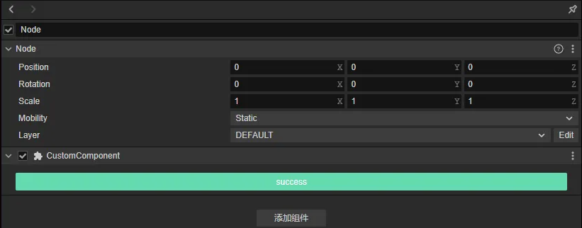
5.监听按钮点击事件,触发组件接口
- 监听点击事件
export const $ = {
    uiButton:".uiButton",
};
type PanelThis = Selector<typeof $> & { dump: any };
export function update(this: PanelThis, dump: any) {
    this.dump = dump;
}
export function ready(this: PanelThis) {
    this.$.uiButton.addEventListener('confirm', () => {
        console.log(this)
        Editor.Message.send("scene", "execute-component-method", { uuid: this.dump.value.uuid.value, name: "_uiButtonEvent", args: [] });
    });
}
- 2.组件中注册接口
@ccclass('CustomComponent')
export class CustomComponent extends Component {
  _uiButtonEvent():void{
      console.log("杨宗宝....");
  }
  ....
}
6.装饰器兼容
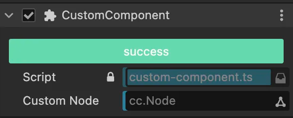
- 此时,我们已经可以在组件的属性中添加一个按钮,并且通过点击按钮来调用组件类中对应的接口,
- 但是当我们按照常规写法,添加一个Node类型的装饰器
@ccclass('CustomComponent')
export class CustomComponent extends Component {
    @property(Node)
    customNode:Node=null;

    _uiButtonEvent():void{
        console.log("杨宗宝....");
    }
}
我们会发现定义的Node类型的装饰器布局无法正常显示。
一句话就是:组件内置的渲染器和我们注册的自定义渲染器是无法并存的。当注册了自定义渲染器后,内置的渲染器将被覆盖。
所以我们就得先了解一下内置组件渲染器,找出为啥会被覆盖。
通过查看引擎源码,我们会在engine/editor/inspector/components目录下找到引擎内置的组件渲染器,并且会发现一个base.js的基础组件渲染器
const { updatePropByDump, disconnectGroup } = require('../utils/prop');
exports.template = `
<div class="component-container">
</div>
`;
exports.$ = {
    componentContainer: '.component-container',
};
exports.update = function(dump) {
    updatePropByDump(this, dump);
};
exports.close = function() {
    disconnectGroup(this);
};
通过代码我们大概可以了解到,基础的组件渲染器有一个容器,并且会在update中去更新属性的显示,
那我我们是不是可以根据内置的基础组件渲染器来完善一下我们的自定义组件渲染器
- 1.将engine/editor/inspector/utils下的prop.js脚本拷贝到自己插件的dist目录下
- 2.修改自定义组件渲染器
'use strict';
const { updatePropByDump, disconnectGroup } = require('./prop');
type Selector<$> = { $: Record<keyof $, any | null> }
export const template = `
<div class="component-container">
<ui-button type="success" class="uiButton">success</ui-button>
`;
exports.style = /* css */`
.uiButton{
    width: 96%;
    margin-left: 2%;
    margin-top: 12px;
    height:25px;
}
`;
export const $ = {
    componentContainer: '.component-container',
    uiButton:".uiButton",
};
type PanelThis = Selector<typeof $> & { dump: any };
export function update(this: PanelThis, dump: any) {
    updatePropByDump(this, dump);
    this.dump = dump;
}

export function ready(this: PanelThis) {
    disconnectGroup(this);
    this.$.uiButton.addEventListener('confirm', () => {
        Editor.Message.send("scene", "execute-component-method", { uuid: this.dump.value.uuid.value, name: "_uiButtonEvent", args: [] });
    });
}
那么到这一步,我们的自定义组件渲染器:添加一个按钮,并且兼容原有的装饰器属性布局渲染的功能就OK了
写在最后
宗宝公众号:穿越的杨宗宝
宗宝微信:Carlos13207


